

How color, light, and the details of a room come together to create a beautiful home.
Paint is one of the simplest ways to transform a space, yet choosing the right color can be surprisingly complex. A shade that looks beautiful on a small sample may feel entirely different once it covers four walls.
At JW Home + Design, we approach paint as part of the larger design story. The goal isn't simply to select a beautiful color. It's to find one that complements the architecture, works with the natural light, and brings the entire room together.
1. Start With the Light
Natural light has an enormous influence on how paint appears throughout the day.
North-facing rooms often receive cooler, indirect light, which can make some grays and whites appear blue. South-facing spaces typically enjoy warmer, brighter light, while east- and west-facing rooms can change dramatically from morning to evening.
Before committing to a color, look at samples in the actual room at several times of day. A beautiful paint color should work with the light you have, not just the light in a showroom photograph.
2. The Beauty of Warm Neutrals
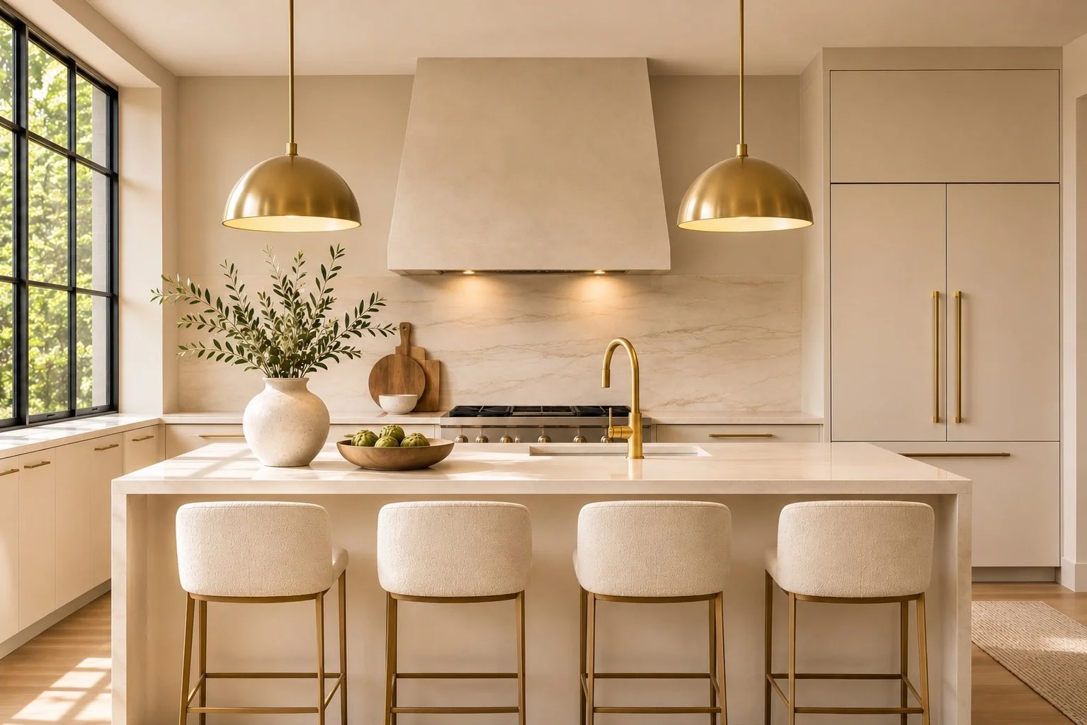
Neutral doesn't have to mean plain.
Soft ivories, warm whites, mushroom tones, and understated taupes can create a beautiful foundation for a home. These colors bring warmth and dimension without competing with furnishings, artwork, or architectural details.
The secret is in the undertones. A creamy white, for example, can feel elegant and inviting, while the wrong yellow or gray undertone can make the same space feel disconnected.
When selecting a neutral, consider the flooring, countertops, cabinetry, and other permanent finishes first.
3. Bring Color Into the Right Places
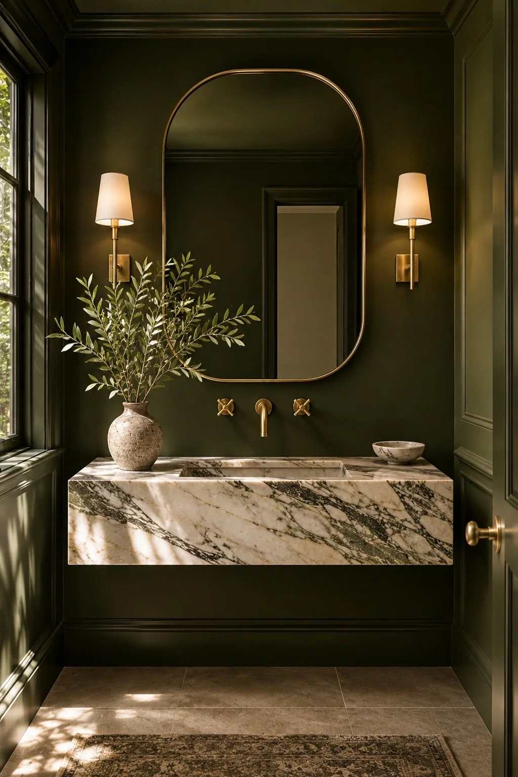
Not every room needs to be neutral.
Muted greens, smoky blues, earthy clay tones, and rich charcoal shades can add depth and personality, particularly in bedrooms, offices, powder rooms, and smaller sitting spaces.
Color can also be used to emphasize beautiful architectural details. Painting walls, trim, and doors in a coordinated shade creates a cohesive, enveloping effect that feels especially sophisticated.
The key is knowing when a room benefits from contrast and when it benefits from continuity.
4. Let the Architecture Lead
A paint color should enhance a home's character rather than compete with it.
A contemporary home with expansive windows and clean lines may benefit from a quiet, restrained palette. A traditional home with detailed millwork may offer opportunities for richer colors and subtle contrasts.
Rather than choosing paint in isolation, consider how the color will connect adjacent rooms and complement the materials already in place.
The most successful palettes feel intentional as you move from one space to the next.
5. Always Test Before You Paint
One of the most common design mistakes is choosing a color from a small paint chip.
Instead, use large painted sample boards that can be moved around the room. Place them near the flooring, cabinetry, upholstery, and windows. Observe how the colors change in natural and artificial light.
It's also important to consider sheen. Matte and eggshell finishes often create a softer appearance on walls, while trim and cabinetry may benefit from more durable finishes with a subtle luster.
A little extra time spent sampling can make all the difference in the finished space.
A Beautiful Home Begins With the Details
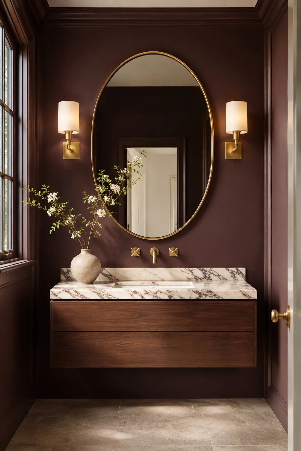
The right paint color does more than change the appearance of a room. It creates a backdrop for the way you live, highlights the features you love, and helps every design element feel connected.
Whether you're refreshing a single room, preparing a property for sale, or planning a complete interior transformation, a cohesive color palette can make a remarkable difference. Pictures are for illustrative purposes.
JW Home + Design offers interior design, home styling, and staging services throughout the Denver area.
Explore our design and staging services at www.jwhomeanddesign.com.